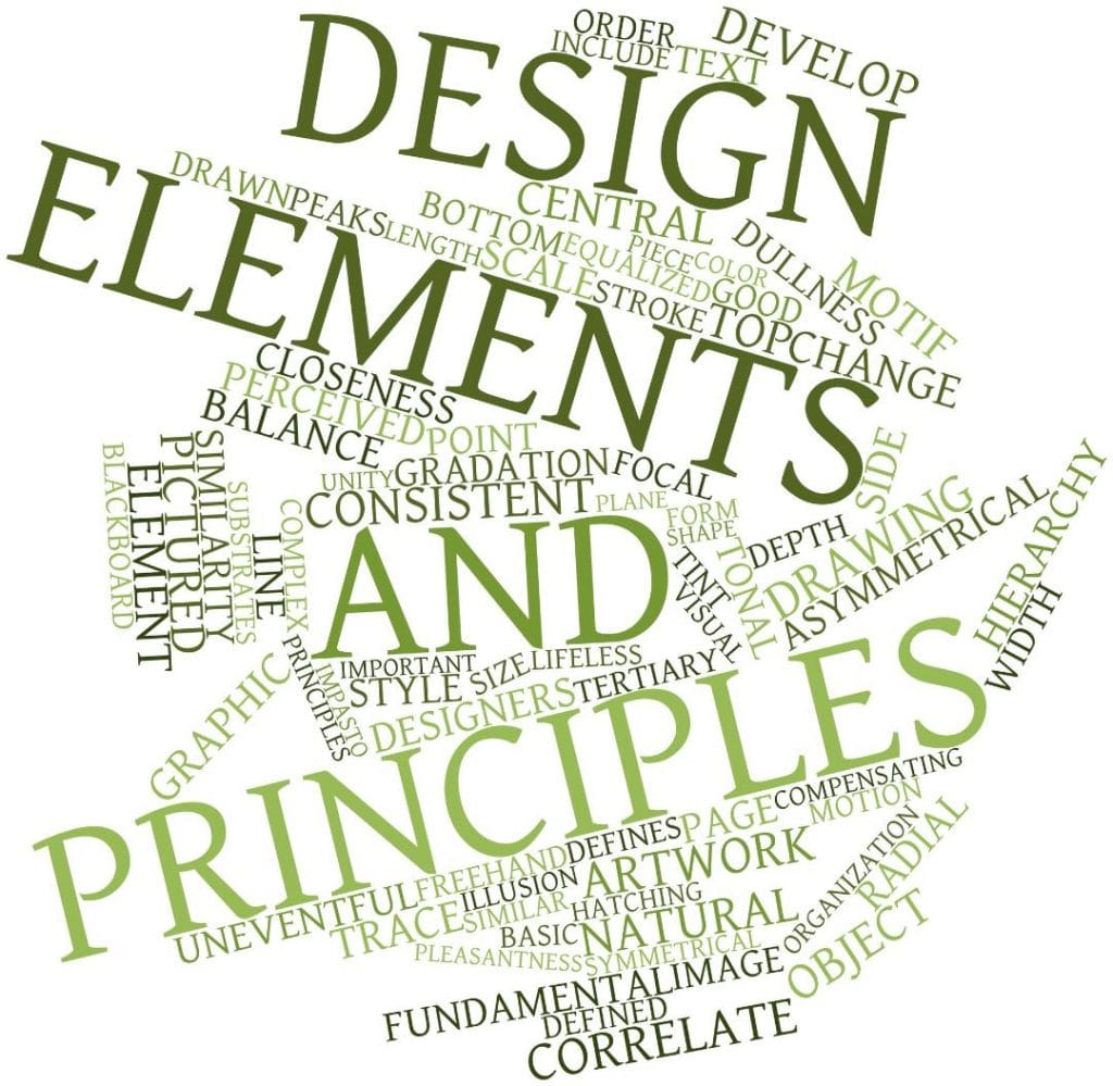
Whether you’re going to be a painter or creating logos for business, you should know about the fundamentals of graphic design.

Have an upcoming graphic design project you’d like to try yourself?
While many people hire professional graphic designers for creative projects, the latest technology makes it easier for amateurs to create professional looking artwork.
But whether you’re creating wall art for your home, wedding invitations or a logo for a new business card, you need to know the fundamentals of graphic design to make your design look professional.
Knowing the foundations of graphic design such as shape, line, and color will enable you to craft designs that look fresh, balanced and attractive. And you’ll develop an artist’s eye in the process while you learn the ropes.
Ready for the essentials of graphic design you need to know for great art projects? Read on for a deep dive into eight of the fundamentals of graphic design that will help you create eye-catching and effective designs.
Get ready to flex your creative muscle!
The Fundamentals of Graphic Design
1. Shape
Shape is one of the most important elements in graphic design. The three main shape styles include geometric, organic and abstract.
Geometric shapes come in circles, squares, rectangles, and triangles. You’ve seen them in company logos like Starbucks.
Organic shapes can often be found in nature such as leaves, mountains or silhouettes.
Abstract shapes don’t represent anything concrete. They’re graphic and stylistic representations. They often mirror shapes, objects and scenes we’re familiar with.
Graphic designers use all these shapes to create company logos for their business cards and letterhead communications. Learn more about how to create logos.
The great thing about shapes is that they can be mixed and matched together to create unique designs.
2. Color
Color affects us intellectually and emotionally. It also evokes certain moods. Pastel colors soothe and relax people. That’s why you’ll often find bedrooms painted in pastel hues.
Have you seen red on restaurant walls? That’s because the color red stirs up our passions of hunger. For more on restaurant design color tips, check out these restaurant logo design tips.
Different colors attract different audiences. It’s common knowledge in marketing. Bright colors appeal to millennials, soft tones appeal to expectant mothers shopping for baby clothes.
And conservative colors appeal to financial companies. You would never see a conservative financial institution using day glow orange next to hot pink in their advertising.
Just look at the logo on one of Merrill Lynch’s website pages. The company uses blue against a white background for their logo.
When choosing colors, it’s best to use a color wheel or color chart to create your visual composition.
These tools will help match colors correctly whether you’re attempting to create contrast or blend similar colors well for your project. The job of color is to create a unified composition.
Can you guess who created the color wheel? You’d never guess it was Sir Isaac Newton, one of the most influential mathematicians and physicists in history!
3. Contrast
The use of contrast pits design elements against each other to make a visual composition pop. Contrast creates clarify and adds visual interest.
This is done by playing with dark and light, putting small and large objects next to each other to give a couple of examples.
Contrast makes artwork energetic and makes objects easier to identify. It’s also used to draw attention to one part of the visual presentation.
Without contrast, elements can be hard to read. For example, using a white font on a light background is difficult to see. But using black on a white background makes the type legible.
4. Line
Lines are used for a variety of purposes in graphic design such as separating an address from a name in a resume or business card. Lines help formulate patterns, they stress words and connect other elements on the page.
Lines act as a blueprint to move your viewer’s eye through your layout. Lines can be vertical, horizontal, have patterns, be thick or thin.
A zigzag line can give the illusion of movement. A straight line, on the other hand, makes something look more grounded.
5. Texture
Texture is related to an object’s surface. Texture can make a surface appear rough or velvety. By using texture, you can provide depth to your design that you wouldn’t have with a flat, smooth surface.
Texture can also create a two-dimensional effect. It can form different layers, be used with text, shapes and line patterns.
6. Size
Varying size in a graphic design adds visual appeal in a layout. Large sizes of objects make the object look prominent and focus the eye on that object. Size creates contrast and draws attention to particular elements in your design.
It makes the dominant object in your layout stand out. Size also dictates an order of importance in a layout.
It works the same way an outline would in the table of contents or the headings on a web page. Size helps the designer guide the viewer’s eye to the intended position on the page.
7. Value
Value concerns itself with lights and darks. It is created using the whitest whites to the blackest blacks and everything in between. Once you know how to use values, you can create contrast and depth to your design.
To make an object look smaller, place darker elements in the background. This is often done in city scenes.
The darker, smaller buildings will create distance, making them appear blocks away from the lighter buildings in the front of a composition.
Value can also express a perception of movement or pull one object into focus while another element fades into the background.
8. Space
Space is used to group or separate graphical, textual and informational elements in a graphic design layout. It leads the viewer’s eye to the place you want it to focus.
Two kinds of space include positive space and negative space. Negative space is the area we call white space, the empty space where there are no elements such an empty space between images in a magazine layout.
But negative space has a purpose: it connects, separates and emphasizes the relationship between the objects within the design. Space can also present the illusion of depth and add make objects like two dimensional or multidimensional.
Final Words On The Fundamentals of Graphic Design
As you can see, the fundamentals of graphic design are part art, part science. By combining color, line, space, shape, value, texture and size, you can learn to create attract visual compositions that look professional.
Picklee offers educational and inspiring content on living, DIY, home and food and drink topics. Explore our website to discover some fun stuff.
